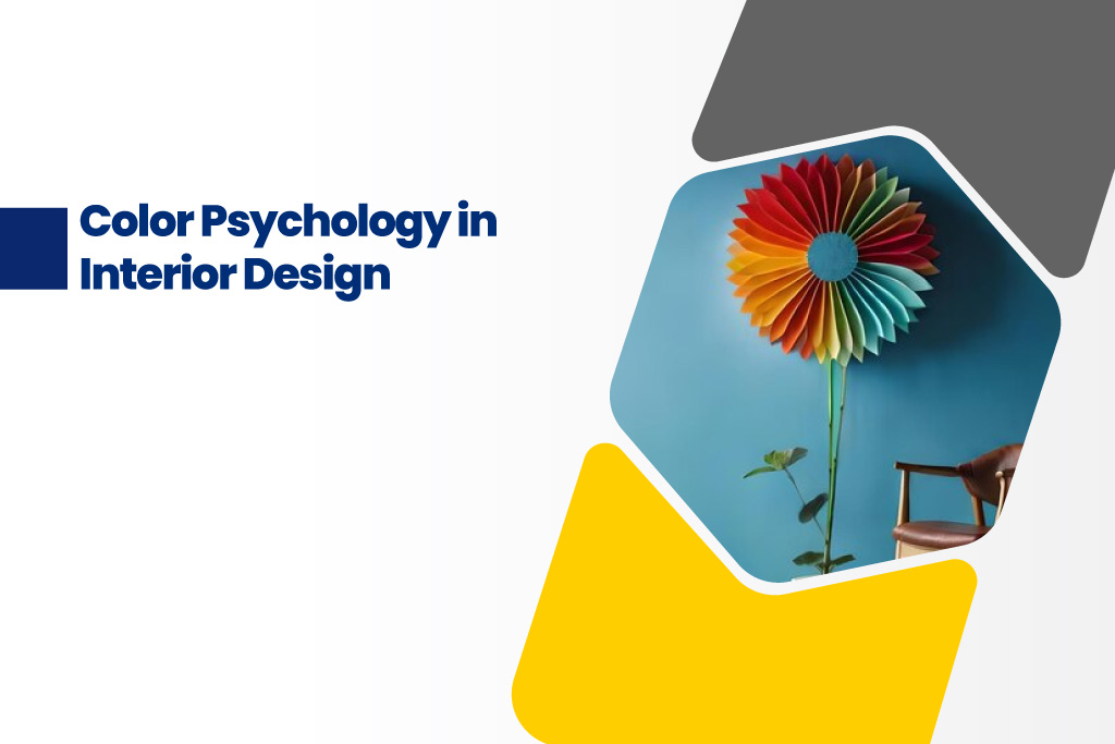
Colors can evoke emotions naturally. Have you ever entered a striking red shade room and felt an instant energy? This is what we call Color Psychology. Usually, color psychology is predominantly used in branding and marketing to attract the audience at a glance, which only colors can do. But color psychology in interior design is an effective tool used by most of the interior designers.
Color psychology explores how colors impact human emotions and how to use them effectively to design a space as per their feelings. Whether it’s about designing a vibrant living area or a productive workspace, colors can make a huge difference.
Psychological Needs in Interior Design
While thinking about interior design, people often think about comfort, functionality, and aesthetics. Colors can influence our emotions, energy, and how we look or feel in a space. By being aware of these impacts, we may design our environments to meet our emotional and lifestyle demands.
For example, consider a home office. A bright, stimulating color can be a better option rather than a soft & calm color. This will help to enhance productivity and increase attention. Likewise, for a bedroom, choosing a calm color can give a more relaxed feel. Choosing colors as per the space’s functionality can improve how we feel and behave in each location by meeting our psychological demands.
Psychological Effects of Colors in Interior Design
Colors are classified into two tones: warm and cool tones. If you are looking to become an interior designer; choosing the right color for the rooms is essential. For rooms where we relax and chill, cool color tones like blue or green shades will be perfect. And for the rooms where we work, warm color tones like red or orange shades will be suitable to increase productivity.
Wondering how to choose them? We have listed out a few colors and their psychological impacts for you to understand better. Read on.
Red: The Color of Energy and Passion
Red is the color of power. In branding, to acquire people’s attention red color is used. You can see red in most of the brands which attracts more people. Similarly, red colors in interior design psychology give a bright and refreshing look making you feel active and energized. Red is great for the spaces where people gather; mostly like a living area or dining area.
But, red is a symbol of warning. Too much red can be unpleasant. So, make sure to use the right amount at the right place or you can be creative by adding only bits and pieces of the color.
Yellow: Bright, Optimistic, and Uplifting
Yellow is often seen as the color of joy and hope. As a ray of sunshine, the yellow color brings positivity and brightness to the room making it a fantastic option for outdoor spaces and kitchens. A brilliant yellow can be a bit too bright, while a gentle pastel yellow can be soothing so choose wisely.
Blue: Calm, Peaceful, and Trustworthy
Don’t you feel calm and at peace as you watch the sea and the sky? The blue color naturally gives a peaceful effect making it a perfect choice for bedrooms and bathrooms. When it comes to color psychology for productivity, blue induces a sense of confidence which is why you can see blue tones in most of the workplaces.
Green: Connection & Balance
Green represents nature. Because of its organic and earthy characteristics, it can be used in any space. In a fast-paced today’s world, green gives a feeling of rejuvenation and peacefulness. Green looks great in areas like kitchens and living rooms where you want a calm yet energizing vibe.
Purple: Creativity & Luxury
Purple has always been linked to richness, ingenuity, and even a hint of mysticism. It’s a fantastic color for igniting the imagination, so it’s perfect for areas like an art studio or reading nook where you want to encourage creativity.
Lighter lavender and lilac tones provide a softer, more calming impact, while darker purples, such as plum or eggplant, lend a rich, opulent sense.
Neutral Colors – The Foundation of Interior Design Psychology
Neutrals like as white, gray, beige, and black are frequently seen as “safe” choices, yet they are also effective color psychology tools. Neutrals can be used to balance off vibrant colors or as a soothing background that lets brighter colors pop. Let’s examine how interior design can use neutrals to satisfy psychological needs.
White: Symbolizing simplicity and purity, white is open, fresh, and clean. White is popular in minimalist homes and smaller spaces since it can provide the impression of more space.
Gray: This neutral goes well with practically any color and is a terrific way to add refinement without overpowering a room.
A Few Useful Hints
Try Different Color Accents: Try using smaller pieces, such as throw cushions, artwork, or carpets, to introduce a vibrant color if you’re not sure you want to commit to it.
Consider the Lighting: Keep in mind that colors will appear and feel differently in natural and artificial light. Intense lighting may make a bright red wall seem overwhelming, yet soft lighting may make it feel comfortable.
Utilize Color to Draw Attention: You can use color to highlight particular parts. For example, adding a pop of color to a feature wall might draw attention to it.
Beyond aesthetics, color psychology in interior design is an interesting area. You may create a home that feels right and looks nice by selecting colors that complement the psychological impacts of color in interior design. The goal is to create environments that enhance your best qualities, whether it be inspiration or relaxation.
So ask yourself, “How do these colors make me feel?” when you look around your house. You may effortlessly satisfy your aesthetic and psychological demands by designing an atmosphere that feels like an extension of yourself with the correct color selections.


